


BACKGROUND
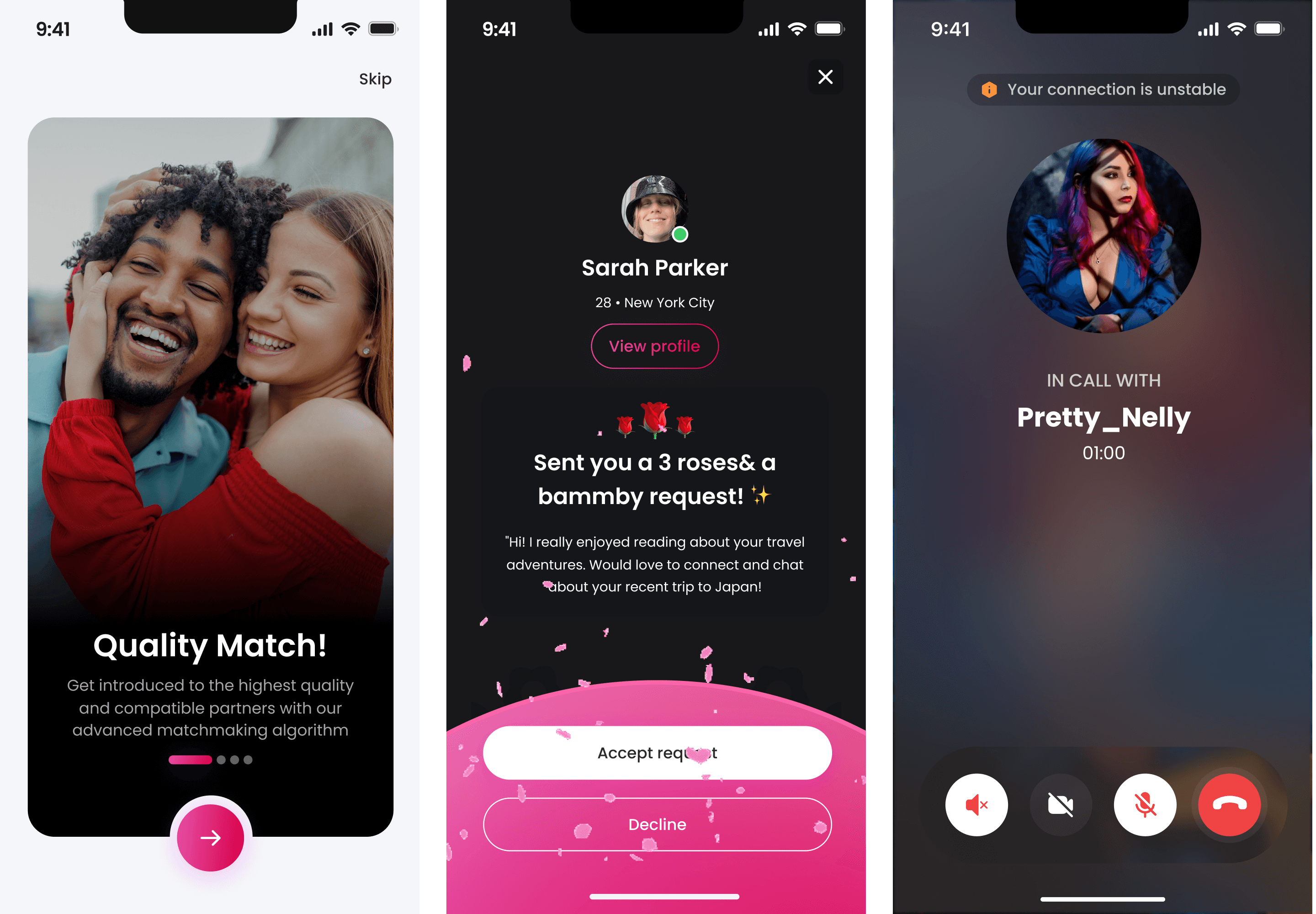
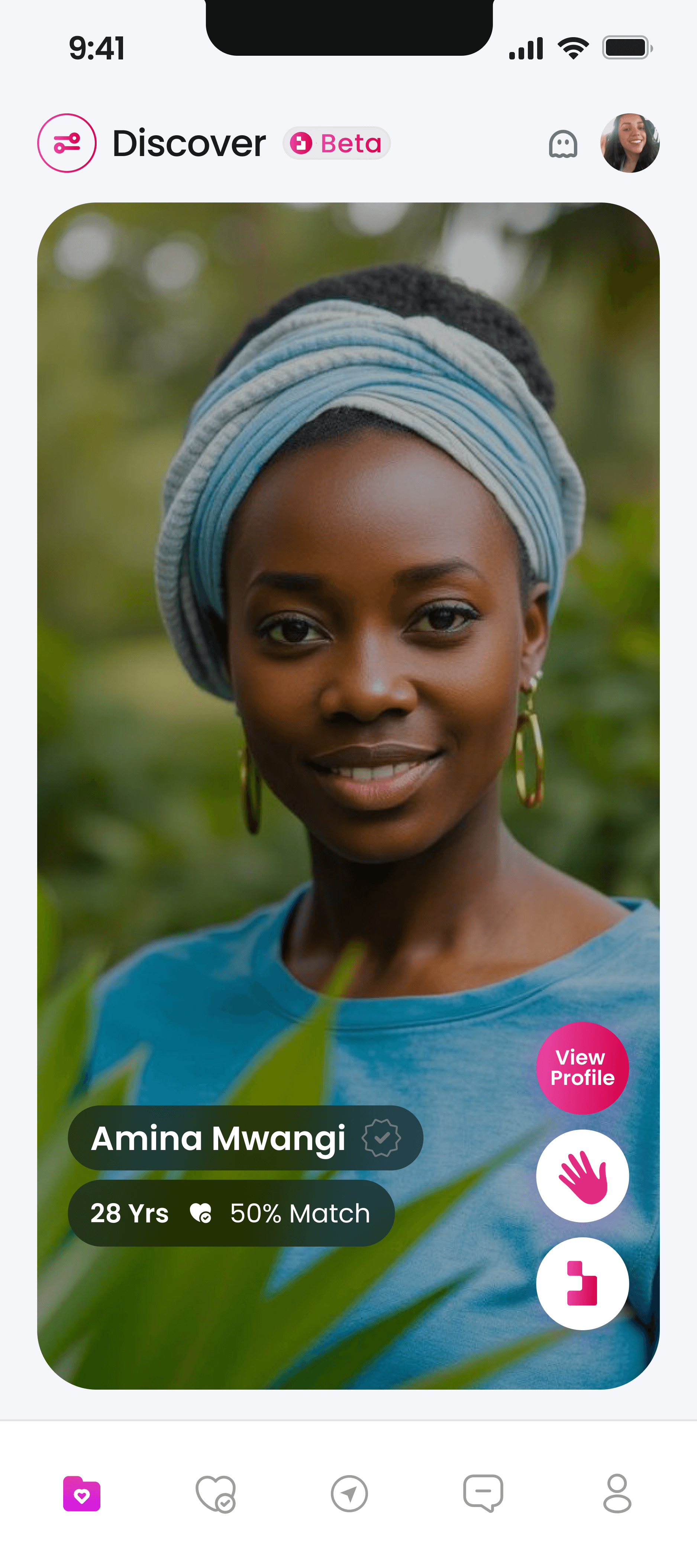
The dating app market was saturated with superficial interfaces focused primarily on photos. Users were growing tired of meaningless connections and wanted deeper, more compatible matches. Bammy emerged as a refreshing alternative, using compatibility percentages to create more meaningful relationships while maintaining an engaging, intuitive user experience.
WHAT WE WANTED TO SOLVE
Creating meaningful connections in a swipe-driven world
Traditional dating apps were leaving users frustrated with low-quality matches based on appearance alone. Our mission was to design an app that prioritized compatibility while keeping the experience fun and visually appealing. We needed to balance sophisticated matching algorithms with an interface that didn't feel clinical or overwhelming.
DEEPDIVING INTO PROBLEM SOLVING
Crafting the perfect matchmaking experience
Working with the product team, I focused on creating a UI that would showcase compatibility scores in an intuitive way while still highlighting personality and attraction. The challenge was significant: how to present complex compatibility data without sacrificing the emotional aspect of dating.
What I discovered
Users wanted to see compatibility first, but still cared about attractive profiles.
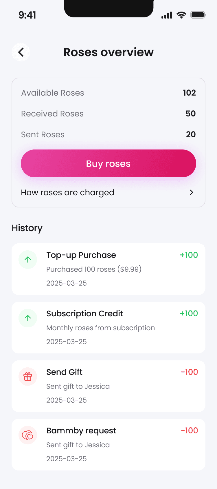
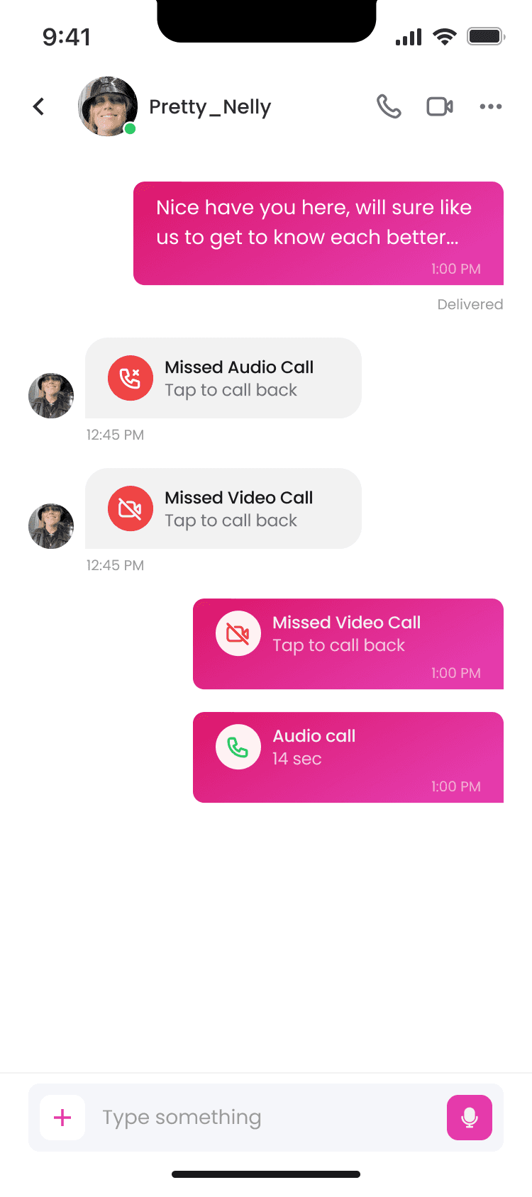
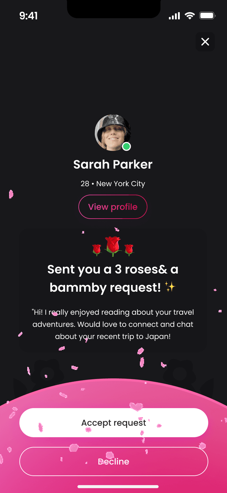
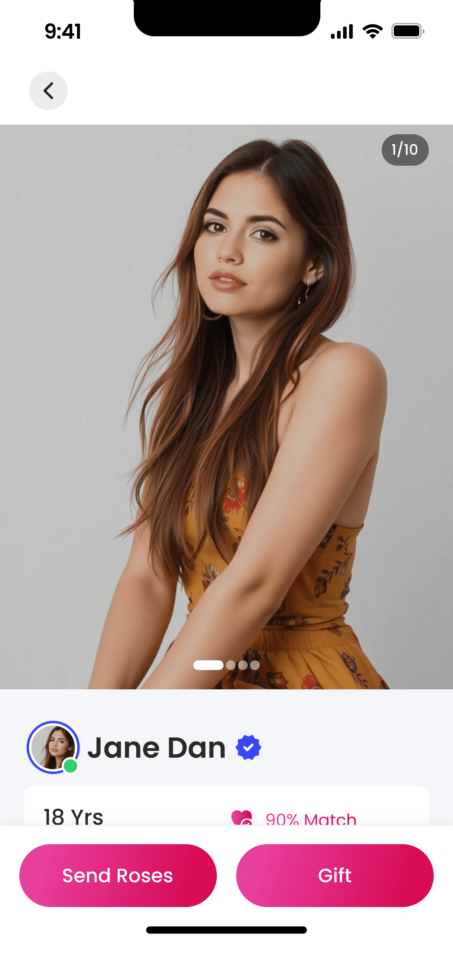
The exchange of digital gifts created meaningful interactions beyond basic messaging.
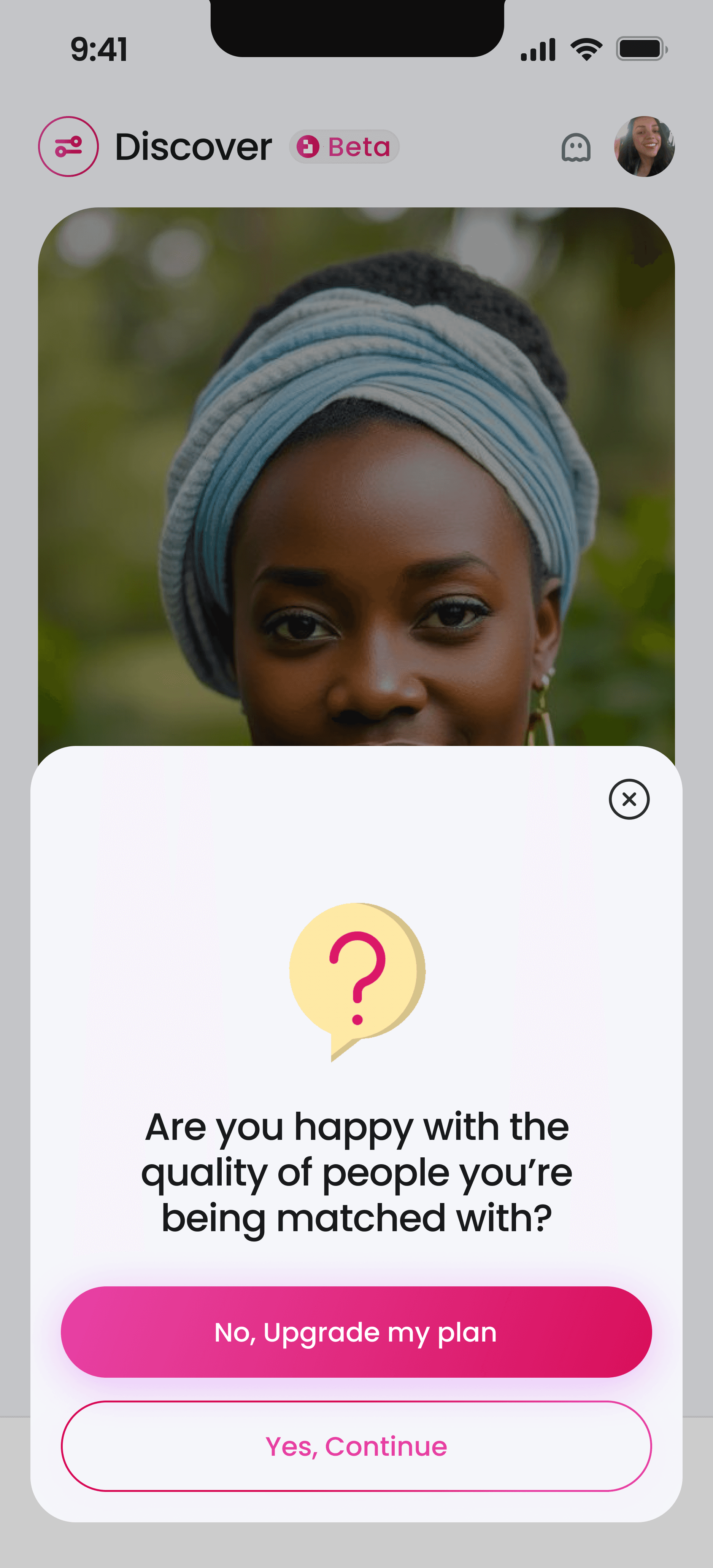
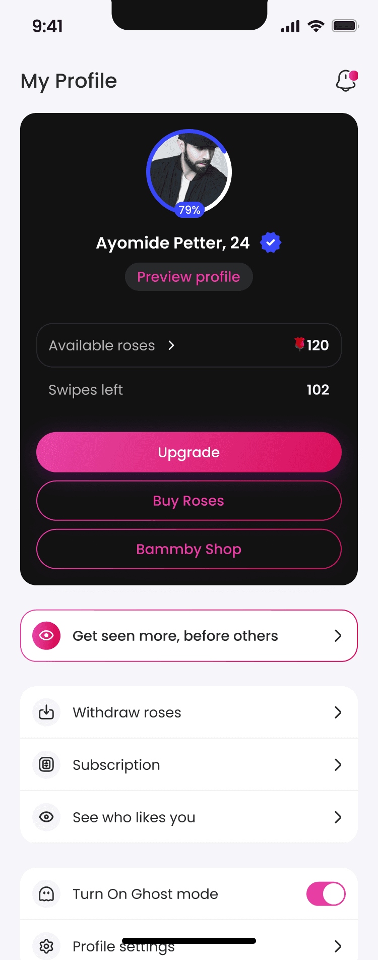
Premium features needed to feel genuinely valuable to drive subscriptions.
Interface clarity directly impacted how users perceived their potential matches.
LET'S COOK
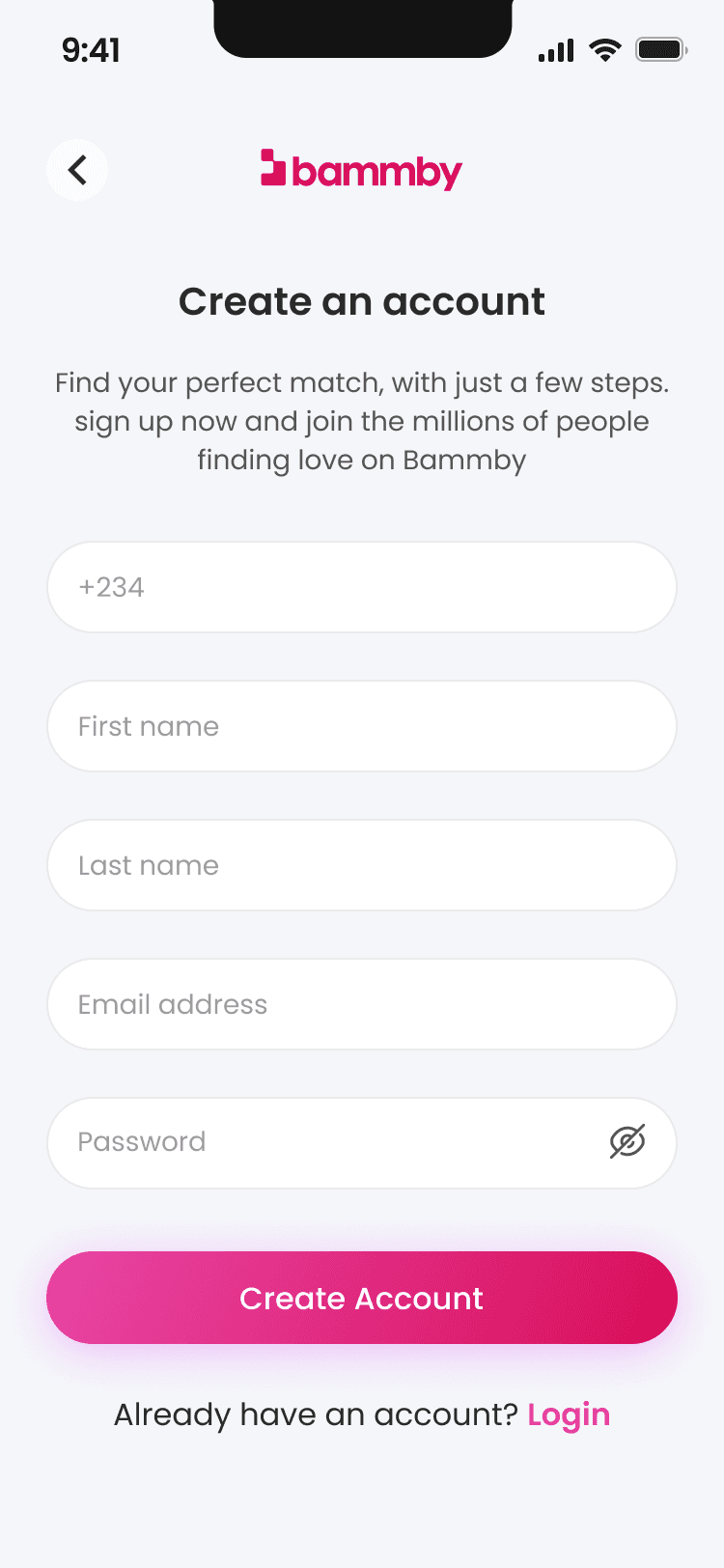
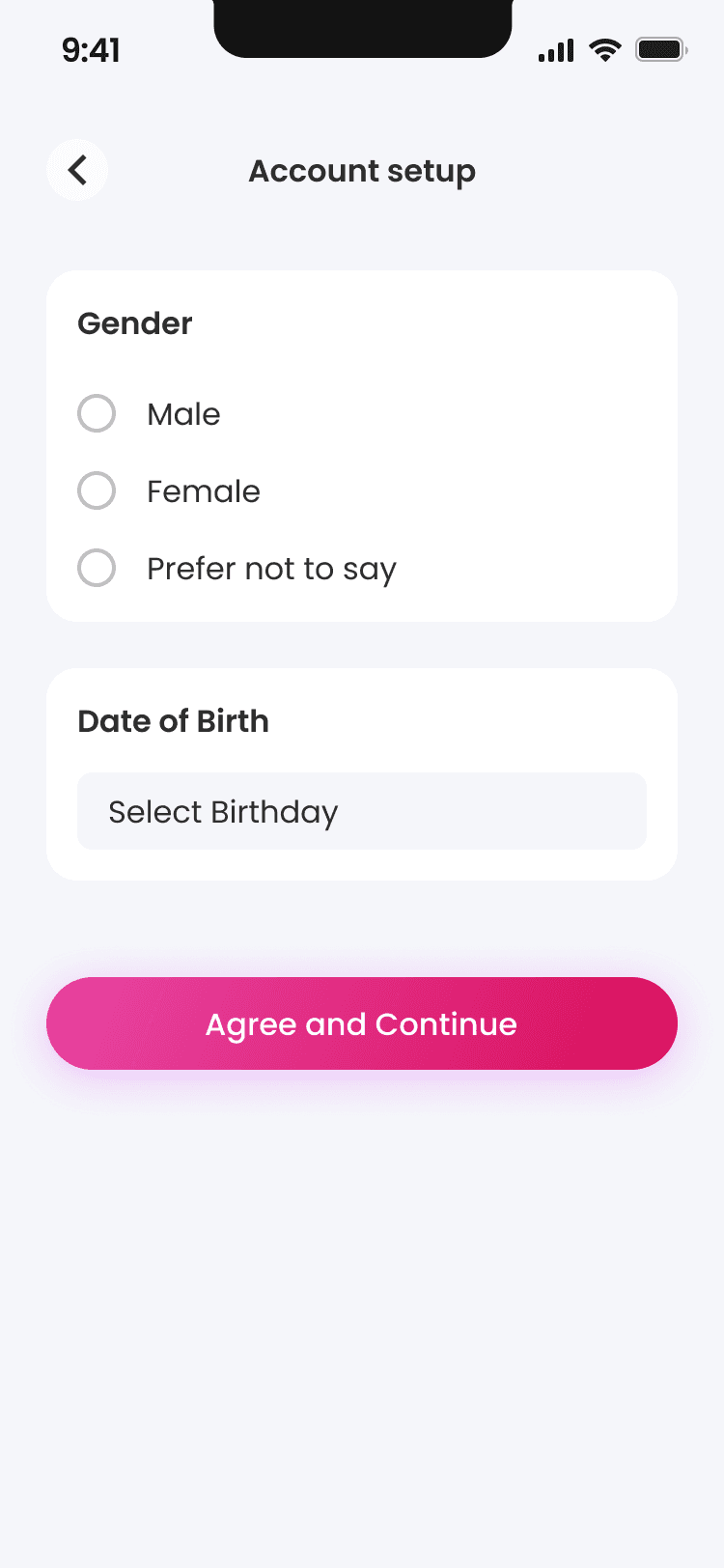
I joined the Bammby project with an existing design foundation already in place. While I would have personally taken a different stylistic approach, I recognized the importance of maintaining visual consistency for users. The challenge became how to enhance and evolve the interface while honoring the established design language.
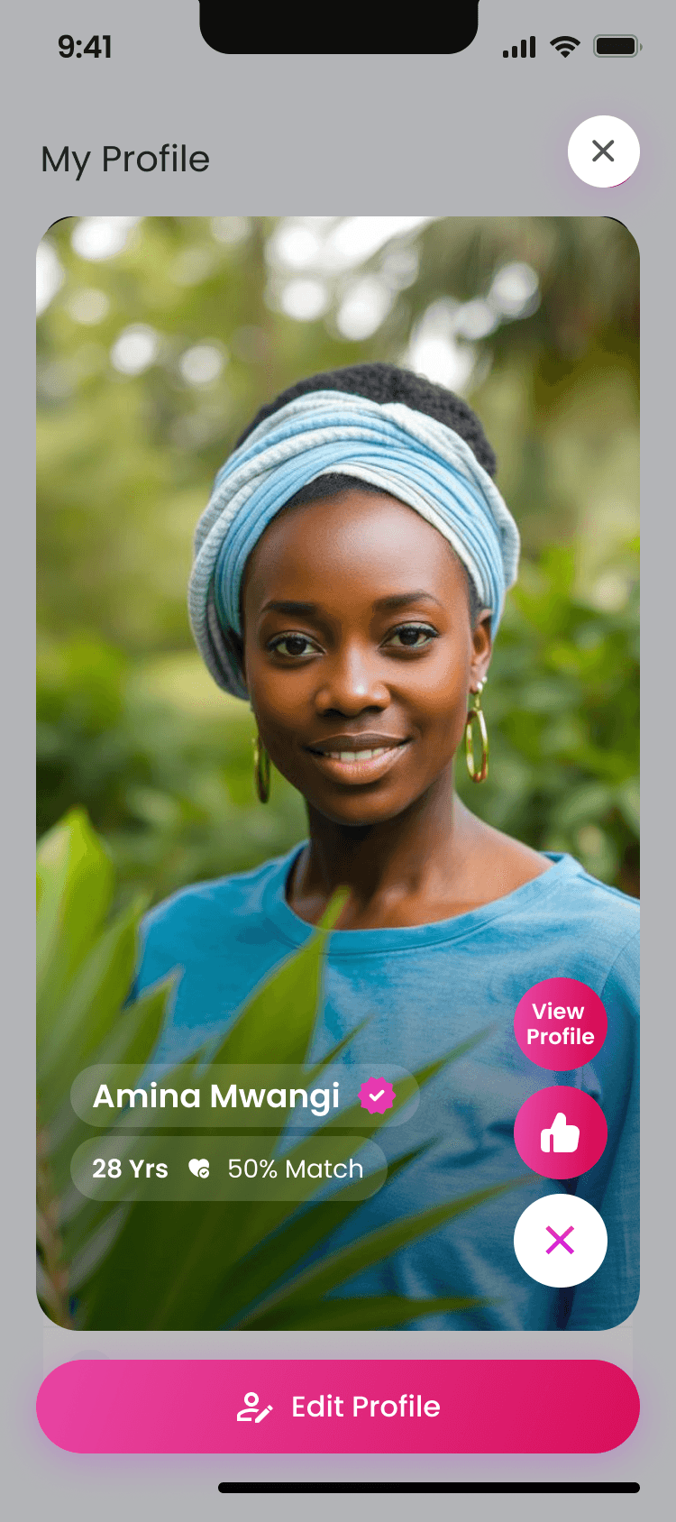
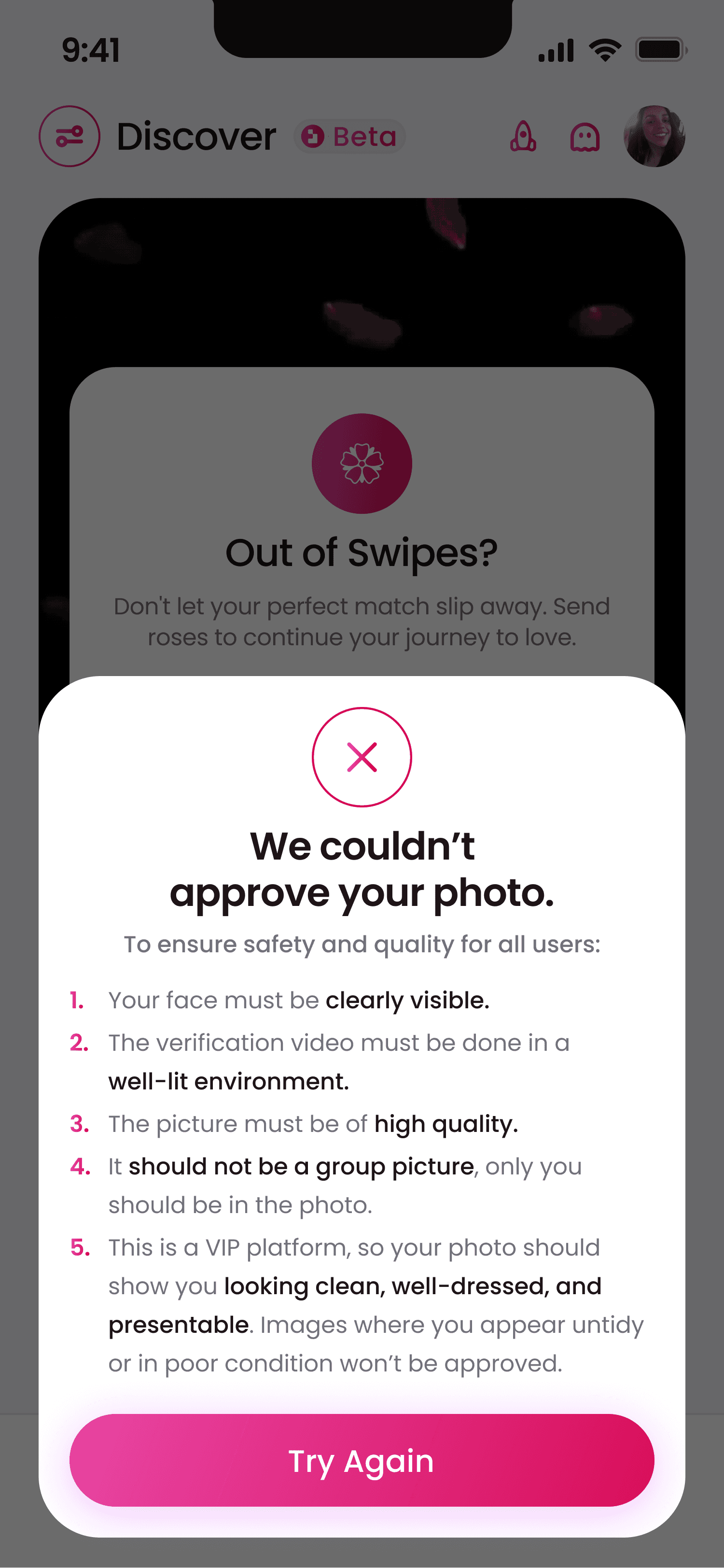
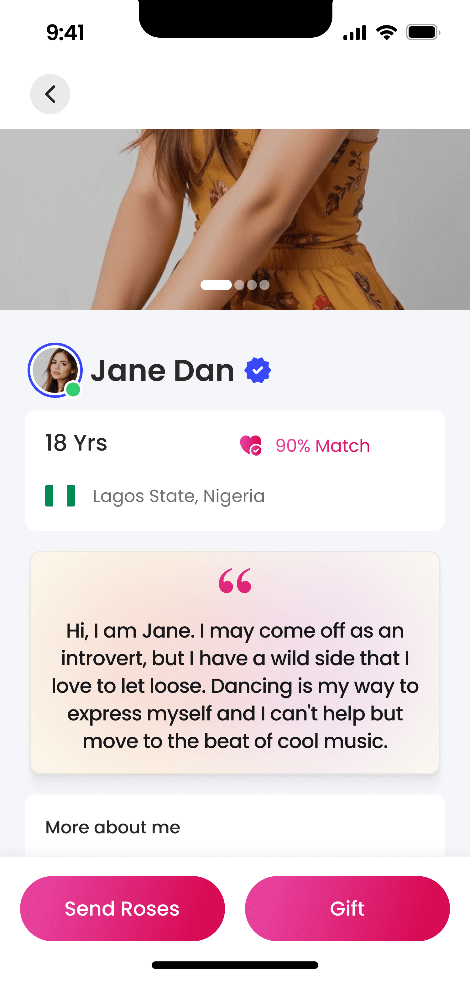
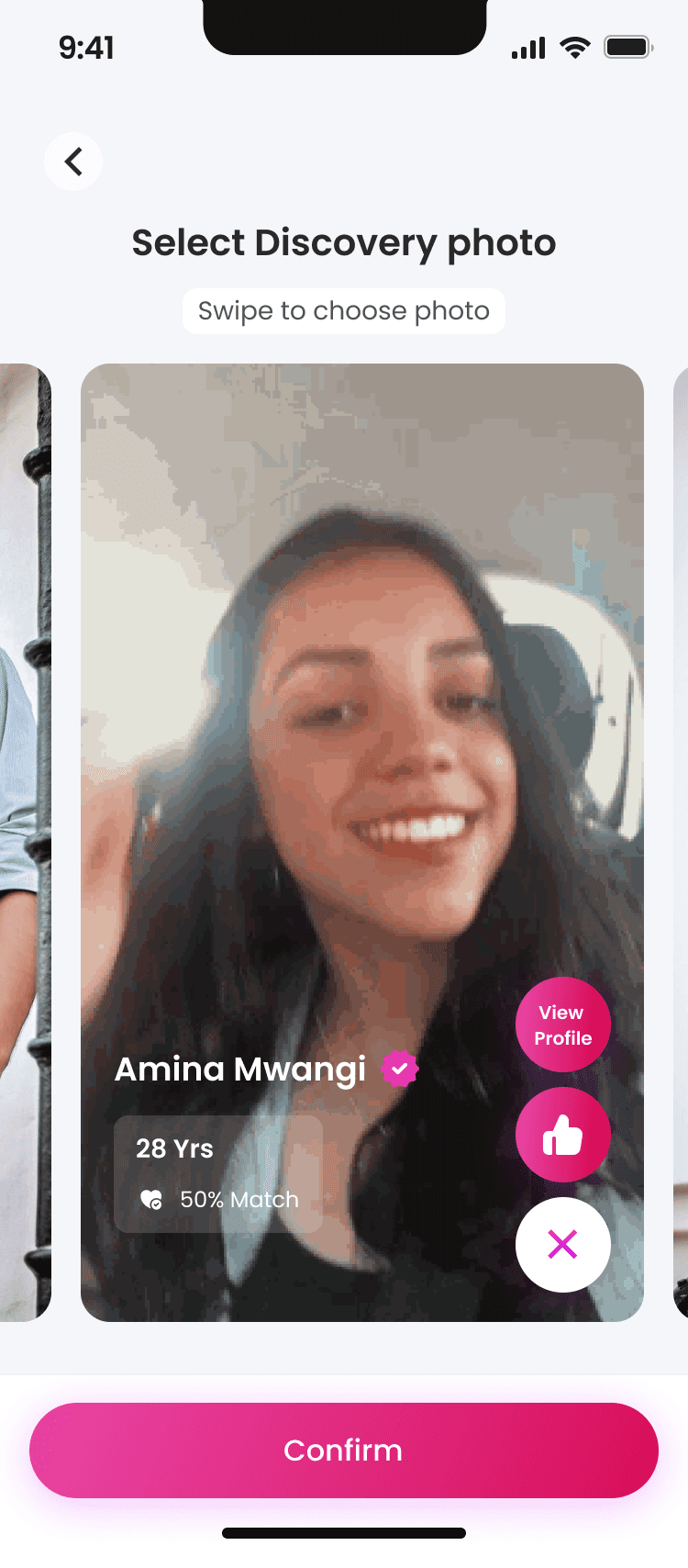
Working within these constraints, I refined how compatibility percentages displayed alongside photos, using subtle color gradients that made match quality immediately apparent without disrupting the overall aesthetic. For the "roses" currency system, I introduced delicate animations that added emotional moments to the gifting experience while still fitting within the existing visual framework.
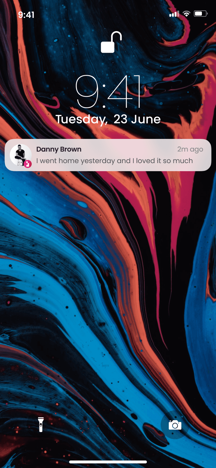
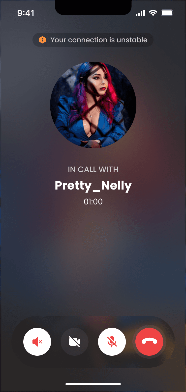
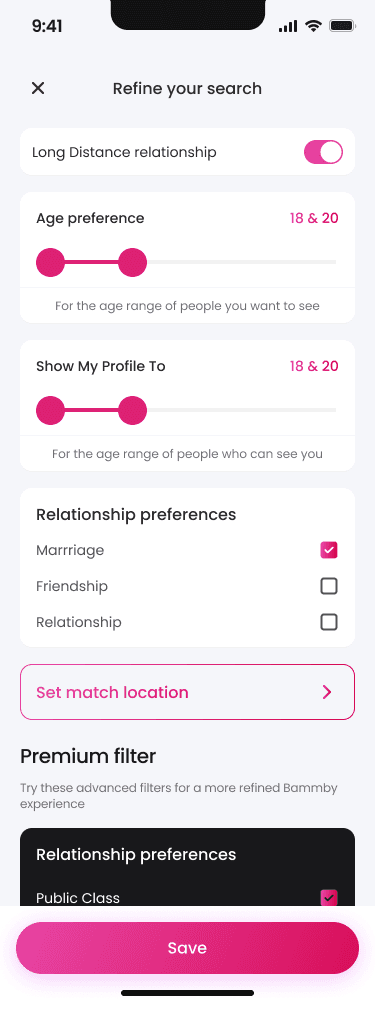
Despite the design limitations, I found opportunities to improve the user experience for premium subscribers through subtle UI enhancements that elevated their experience without creating disconnection from the core app. I advocated for microinteractions that made the app feel more responsive and engaging, which were adopted and significantly improved user satisfaction scores.
Had I been given creative freedom from the start, I would have implemented a more intuitive navigation system and a warmer color palette to enhance the emotional connection. However, working within constraints proved valuable, teaching me how to maintain consistency while still making meaningful improvements that contributed to the app's impressive metrics.



VANITY METRICS
100k
Active users within
first year
78%
User retention rate after
six months
43%
Conversion to premium
subscriptions
KEY TAKEAWAYS
Bammby's success demonstrates that dating apps can balance data with delight. By creating an interface that beautifully presents compatibility information while maintaining the emotional aspects of dating, we've helped thousands find meaningful connections. The high retention and subscription rates prove that users value an experience that goes beyond superficial swiping. As the app continues to grow, the design system we established ensures it can evolve while maintaining the visual identity that users have come to love.